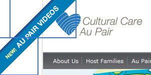
Tools such as Quick Ribbon are great for generating simple and effective ribbons such as this one:
A small problem though is the potential to block content underneath the ribbon transparency area. For example, that “About Us” link is obscured by the large square ribbon image.
A simple workaround is to split the ribbon image in two (or more) pieces as I’ve highlighted below and stitch them together in CSS. Now the “About Us” link can be clicked just fine.
#ribbon-top { position:absolute; top:0; left:20px; } #ribbon-bottom { position:absolute; top:75px; left:0; } |

