ORHS Webdesign Workshop
Design Examples

Webdesign Workshop

May 2001

Oyster River High School


main page

color rules

the colors of the internet

design examples

further resources

  ie.gif (1219 bytes)


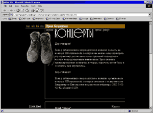
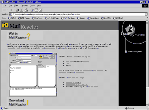
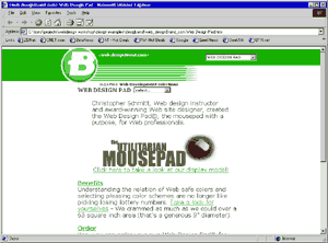
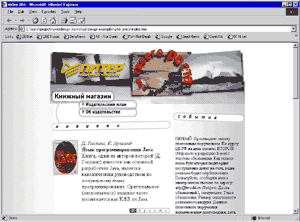
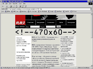
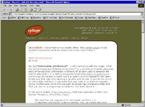
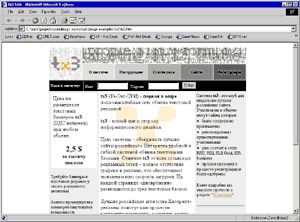
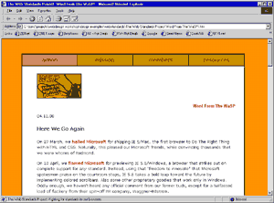
One of the initial steps to becoming an affluent Webdesigner is recognizing what good design looks like. Seeing the work of others often brings out ideas for your own work. It is important for a webpage to be attractive, fast loading and practical. Keeping all these expectations in balance is a tricky art. Here is a small collection of some on the best designed pages online. Click on each thumbnail to load the full website.
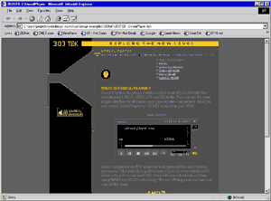
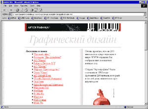
303tek.gif (7020 bytes)   artografika.gif (8807 bytes)

bogushevich.gif (7759 bytes)   daansystems.gif (10759 bytes)

 designbrand.gif (8811 bytes)   piter press.gif (12783 bytes)

 rb1.gif (14447 bytes)   sylloge.gif (9060 bytes)

 tx3.gif (11712 bytes)   webstandards.gif (9491 bytes)


This workshop has been planned and presented by

Boris Masis, ORHS Student and Webdesigner www.bluehue.com